class: center, middle, inverse, title-slide # A sampling of bioinformatics using R ### Abhijit Dasgupta, PhD --- layout: true <div class="my-header"> <span style="left: 15px; bottom:2px;">BIOF 439: Data Visualization with R</span> <span style='right:15px; bottom:2px;'>Abhijit Dasgupta</span> </div> --- ## Expectations 1. We will explore - the basics of using Bioconductor packages for bioinformatics - visualizations useful for bioinformatics - ways to annotate our graphics 1. We will not explore - how to do bioinformatics using R - bioinformatic workflows - data cleaning, modeling, analytics This area is too broad and interests too varied to cover this with any sort of breadth or depth. --- ## A very simple example ```r clinical <- rio::import('data/BreastCancer_Clinical.xlsx') %>% janitor::clean_names() proteome <- rio::import('data/BreastCancer_Expression.xlsx') %>% janitor::clean_names() final_data <- clinical %>% inner_join(proteome, by = c('complete_tcga_id' = 'tcga_id')) %>% filter(gender == 'FEMALE') %>% select(complete_tcga_id, age_at_initial_pathologic_diagnosis, er_status, starts_with("np")) head(final_data) ``` ``` #> complete_tcga_id age_at_initial_pathologic_diagnosis er_status np_958782 #> 1 TCGA-A2-A0CM 40 Negative 0.6834035 #> 2 TCGA-BH-A18Q 56 Negative 0.1953407 #> 3 TCGA-A7-A0CE 57 Negative -1.1231731 #> 4 TCGA-D8-A142 74 Negative 0.5385958 #> 5 TCGA-AO-A0J6 61 Negative 0.8311317 #> 6 TCGA-A2-A0YM 67 Negative 0.6558497 #> np_958785 np_958786 np_000436 np_958781 np_958780 np_958783 np_958784 #> 1 0.6944241 0.6980976 0.6870771 0.6870771 0.6980976 0.6980976 0.6980976 #> 2 0.2154129 0.2154129 0.2053768 0.2154129 0.2154129 0.2154129 0.2154129 #> 3 -1.1231731 -1.1168605 -1.1294857 -1.1294857 -1.1200168 -1.1231731 -1.1231731 #> 4 0.5422105 0.5422105 0.5349810 0.5422105 0.5422105 0.5422105 0.5422105 #> 5 0.8565398 0.8565398 0.8367780 0.8650092 0.8565398 0.8508936 0.8508936 #> 6 0.6581426 0.6558497 0.6558497 0.6512639 0.6581426 0.6558497 0.6558497 #> np_112598 np_001611 #> 1 -2.6521501 -0.9843733 #> 2 -1.0357599 -0.5172257 #> 3 2.2445844 -2.5750648 #> 4 -0.1482049 0.2674902 #> 5 -0.9671961 2.8383705 #> 6 -1.9695337 1.3070365 ``` --- ## A very simple example ```r results <- final_data %>% * summarise_at(vars(starts_with('np')), * ~wilcox.test(. ~ er_status)$p.value) results ``` ``` #> np_958782 np_958785 np_958786 np_000436 np_958781 np_958780 np_958783 #> 1 0.6988415 0.6910103 0.6832121 0.6910103 0.6832121 0.6910103 0.6910103 #> np_958784 np_112598 np_001611 #> 1 0.6832121 0.9957714 0.0001218627 ``` `.` is the placeholder for what's specified inside the `vars()`. -- This isn't in the right format for me to plot --- ## A very simple example .pull-left[ ```r results %>% tidyr::pivot_longer(cols=everything(), names_to='protein', values_to='pvalue') ``` ``` #> # A tibble: 10 x 2 #> protein pvalue #> <chr> <dbl> #> 1 np_958782 0.699 #> 2 np_958785 0.691 #> 3 np_958786 0.683 #> 4 np_000436 0.691 #> 5 np_958781 0.683 #> 6 np_958780 0.691 #> 7 np_958783 0.691 #> 8 np_958784 0.683 #> 9 np_112598 0.996 #> 10 np_001611 0.000122 ``` ] --- ## A very simple example .pull-left[ ```r theme_439 <- theme_bw() + theme(axis.title = element_text(size=16), axis.text = element_text(size=8)) results %>% pivot_longer( cols=everything(), names_to='protein', values_to='pvalue') %>% ggplot(aes(x = protein, y = pvalue)) + geom_point() + theme_439 ``` ] .pull-right[ <!-- --> ] --- ## A very simple example .pull-left[ ```r results %>% pivot_longer( cols=everything(), names_to = 'protein', values_to = 'pvalue') %>% ggplot(aes(x = protein, y = pvalue)) + geom_point() + * geom_segment(aes(x = protein, xend = protein, * y = 0, yend = pvalue))+ theme_439 ``` ] .pull-right[ <!-- --> ] --- ## A very simple example .pull-left[ ```r results %>% pivot_longer( cols=everything(), names_to = 'protein', values_to = 'pvalue') %>% ggplot(aes(x = protein, y = pvalue)) + geom_point() + geom_segment(aes(x = protein, xend = protein, y = 0, yend = pvalue))+ * geom_hline(yintercept = 0.05, linetype=2)+ theme_439 ``` ] .pull-right[ <!-- --> ] ??? This is basically the beginnings of a Manhattan plot --- ## Manhattan plot A Manhattan plot is used to visualize a set of p-values from unit-based tests It plots the negative log p-value at each unit .pull-left[ ```r results %>% pivot_longer( cols=everything(), names_to = 'protein', values_to = 'pvalue') %>% ggplot(aes(x = protein, y = -log10(pvalue))) + geom_point() + geom_segment(aes(xend = protein, yend = 0))+ geom_hline(yintercept = 8, linetype=2)+ labs(x = 'Protein', y = expression(log[10](p-value))) + theme_439 ``` ] .pull-right[ <!-- --> ] --- ## Manhattan plot There is a specialized package for doing Manhattan plots and quantile plots for GWAS data This package is meant to work with PLINK output, but the function is generic .pull-left[ ```r *library(qqman) manhattan(gwasResults) ``` ] .pull-right[ <!-- --> ] --- ## Manhattan plot .pull-left[ ```r *library(qqman) manhattan(gwasResults, annotatePval = 1e-6, annotateTop=F) ``` ] .pull-right[ <!-- --> ] ??? Look at the help for manhattan --- ## ggplot tours Manhattan ### Data prep .pull-left[ ```r head(gwasResults) ``` ] .pull-right[ ``` #> SNP CHR BP P #> 1 rs1 1 1 0.9148060 #> 2 rs2 1 2 0.9370754 #> 3 rs3 1 3 0.2861395 #> 4 rs4 1 4 0.8304476 #> 5 rs5 1 5 0.6417455 #> 6 rs6 1 6 0.5190959 ``` ] --- ## ggplot tours Manhattan ### Data prep .pull-left[ ```r plt_x_position <- gwasResults %>% group_by(CHR) %>% summarize(chr_len = max(BP)) %>% mutate(tot = cumsum(chr_len) - chr_len) head(plt_x_position) ``` ] .pull-right[ ``` #> # A tibble: 6 x 3 #> CHR chr_len tot #> <int> <int> <int> #> 1 1 1500 0 #> 2 2 1191 1500 #> 3 3 1040 2691 #> 4 4 945 3731 #> 5 5 877 4676 #> 6 6 825 5553 ``` ] --- ## ggplot tours Manhattan ### Data prep .pull-left[ ```r plt_dat <- gwasResults %>% left_join(plt_x_position %>% select(-chr_len), by = c('CHR'='CHR')) %>% arrange(CHR, BP) %>% mutate(BPcumul = BP + tot) tail(plt_dat) ``` ] .pull-right[ ``` #> SNP CHR BP P tot BPcumul #> 16465 rs16465 22 530 0.5643702 15935 16465 #> 16466 rs16466 22 531 0.1382863 15935 16466 #> 16467 rs16467 22 532 0.3936999 15935 16467 #> 16468 rs16468 22 533 0.1778749 15935 16468 #> 16469 rs16469 22 534 0.2393020 15935 16469 #> 16470 rs16470 22 535 0.2630441 15935 16470 ``` ] --- ## ggplot tours Manhattan ### Data for plotting x-axis labels .pull-left[ ```r axisdf <- plt_dat %>% group_by(CHR) %>% summarize(center = (max(BPcumul)+min(BPcumul))/2) axisdf ``` ] .pull-right[ ``` #> # A tibble: 22 x 2 #> CHR center #> * <int> <dbl> #> 1 1 750. #> 2 2 2096 #> 3 3 3212. #> 4 4 4204 #> 5 5 5115 #> 6 6 5966 #> 7 7 6770. #> 8 8 7538. #> 9 9 8273 #> 10 10 8982. #> # … with 12 more rows ``` ] --- ## ggplot tours Manhattan ### Plotting .pull-left[ ```r ggplot(plt_dat, aes(x = BPcumul, y = -log10(P)))+ geom_point() ``` ] .pull-right[ <!-- --> ] --- ## ggplot tours Manhattan ### Plotting .pull-left[ ```r ggplot(plt_dat, aes(x = BPcumul, y = -log10(P)))+ * geom_point(aes(color = as.factor(CHR)), * alpha = 0.8, size=1.3) ``` ] .pull-right[ <!-- --> ] --- ## ggplot tours Manhattan ### Plotting .pull-left[ ```r ggplot(plt_dat, aes(x = BPcumul, y = -log10(P)))+ geom_point(aes(color = as.factor(CHR)), alpha = 0.8, size=1.3) + scale_color_manual( values = rep(c('grey','skyblue'), 22)) ``` ] .pull-right[ <!-- --> ] --- ## ggplot tours Manhattan ### Plotting .pull-left[ ```r ggplot(plt_dat, aes(x = BPcumul, y = -log10(P)))+ geom_point(aes(color = as.factor(CHR)), alpha = 0.8, size=1.3) + scale_color_manual( values = rep(c('grey','skyblue'), 22))+ * scale_x_continuous( * name = 'Chromosome', * breaks = axisdf$center, * labels = axisdf$CHR * ) ``` ] .pull-right[ <!-- --> ] --- ## ggplot tours Manhattan ### Plotting .pull-left[ ```r ggplot(plt_dat, aes(x = BPcumul, y = -log10(P)))+ geom_point(aes(color = as.factor(CHR)), alpha = 0.8, size=1.3) + scale_color_manual( values = rep(c('grey','skyblue'), 22))+ scale_x_continuous( name = 'Chromosome', breaks = axisdf$center, labels = axisdf$CHR ) + * scale_y_continuous(expand = c(0,0)) + theme_bw() ``` ] .pull-right[ <!-- --> ] --- ## ggplot tours Manhattan ### Plotting .pull-left[ ```r ggplot(plt_dat, aes(x = BPcumul, y = -log10(P)))+ geom_point(aes(color = as.factor(CHR)), alpha = 0.8, size=1.3) + scale_color_manual( values = rep(c('grey','skyblue'), 22))+ scale_x_continuous( name = 'Chromosome', breaks = axisdf$center, labels = axisdf$CHR ) + * scale_y_continuous(expand = c(0,0)) + theme_bw() + * geom_point(data = plt_dat %>% filter(P < 1e-5), color = 'orange', size=2) ``` ] .pull-right[ <!-- --> ] --- ## ggplot tours Manhattan ### Plotting .pull-left[ ```r (plt_manhattan <- ggplot(plt_dat, aes(x = BPcumul, y = -log10(P)))+ geom_point(aes(color = as.factor(CHR)), alpha = 0.8, size=1.3) + scale_color_manual( values = rep(c('grey','skyblue'), 22))+ scale_x_continuous( name = 'Chromosome', breaks = axisdf$center, labels = axisdf$CHR ) + scale_y_continuous(expand = c(0,0)) + theme_bw() + * geom_point(data = plt_dat %>% filter(P < 1e-5), color = 'orange', size=2)+ geom_hline(yintercept = -log10(5e-8), linetype=2)+ theme(legend.position='none', panel.grid.major.x=element_blank(), panel.grid.minor.x = element_blank()) ) ``` ] .pull-right[ <!-- --> ] --- ## ggplot tours Manhattan ### Annotation .pull-left[ ```r *library(ggrepel) plt_manhattan + geom_label_repel( data = plt_dat %>% filter(P < 1e-5), aes(label = SNP), size = 2) ``` ] .pull-right[ <!-- --> ] --- ## Circular Manhattan plots .pull-left[ ```r library(CMplot) CMplot(gwasResults, plot.type = 'c', r = 1.6, cir.legend = T, outward=T, cir.legend.col='black', cir.chr.h=.1, chr.den.col='orange', file.output=F) ``` ] .pull-right[ <!-- --> ``` #> Circular-Manhattan Plotting P. ``` ] --- class: middle,center # Heatmaps --- ## Let us count the ways There are several ways of doing heatmaps in R: + [https://jokergoo.github.io/ComplexHeatmap-reference/book/](ComplexHeatmap) + [http://sebastianraschka.com/Articles/heatmaps_in_r.html](http://sebastianraschka.com/Articles/heatmaps_in_r.html) + [https://plot.ly/r/heatmaps/](https://plot.ly/r/heatmaps/) + [http://moderndata.plot.ly/interactive-heat-maps-for-r/](http://moderndata.plot.ly/interactive-heat-maps-for-r/) + [http://www.siliconcreek.net/r/simple-heatmap-in-r-with-ggplot2](http://www.siliconcreek.net/r/simple-heatmap-in-r-with-ggplot2) + [https://rud.is/b/2016/02/14/making-faceted-heatmaps-with-ggplot2/](https://rud.is/b/2016/02/14/making-faceted-heatmaps-with-ggplot2/) --- ## Some example data ```r library(Biobase) #data(sample.ExpressionSet) exdat <- readRDS('data/exprset.rds') library(limma) design1 <- model.matrix(~type, data=pData(exdat)) lm1 <- lmFit(exprs(exdat), design1) lm1 <- eBayes(lm1) # compute linear model for each probeset geneID <- rownames(topTable(lm1, coef = 2, number = 100, adjust.method = 'none', p.value = 0.05)) exdat2 <- exdat[geneID,] # Keep features with p-values < 0.05 head(exdat2) ``` ``` #> ExpressionSet (storageMode: lockedEnvironment) #> assayData: 6 features, 26 samples #> element names: exprs, se.exprs #> protocolData: none #> phenoData #> sampleNames: A B ... Z (26 total) #> varLabels: sex type score #> varMetadata: labelDescription #> featureData: none #> experimentData: use 'experimentData(object)' #> Annotation: hgu95av2 ``` --- ## Using Heatplus .pull-left[ ```r # BiocManager::install('Heatplus') library(Heatplus) reg1 <- regHeatmap(exprs(exdat2), legend=2, col=heat.colors, breaks=-3:3) plot(reg1) ``` ] .pull-right[ <!-- --> ] --- ## Using Heatplus .pull-left[ ```r corrdist <- function(x) as.dist(1-cor(t(x))) hclust.avl <- function(x) hclust(x, method='average') reg2 <- regHeatmap(exprs(exdat2), legend=2, col=heat.colors, breaks=-3:3, dendrogram = list(clustfun=hclust.avl, distfun=corrdist)) plot(reg2) ``` ] .pull-right[ <!-- --> ] --- ## Using Heatplus ### Adding annotations .pull-left[ ```r ann1 <- annHeatmap(exprs(exdat2), * ann=pData(exdat2), col = heat.colors) plot(ann1) ``` ] .pull-right[ <!-- --> ] --- ## Using Heatplus ### Adding annotations .pull-left[ ```r ann2 <- annHeatmap(exprs(exdat2), ann=pData(exdat2), col = heat.colors, cluster = list(cuth=7500, label=c('Control-like','Case-like'))) plot(ann2) ``` ] .pull-right[ <!-- --> ] --- ## Using ComplexHeatmap <!-- --> --- ## UpSet plots UpSet plots are nice visualizations for looking at commonalities (complex intersections) between sets of objects. In BIOF339 we used UpSet plots to look at missing value patterns <!-- --> --- ## UpSet plots  --- # clusterProfiler Enrichment network based on GSEA <!-- --> --- class:middle, center # Playing with Seurat --- ## Example data ```r library(Seurat) # pbmc.data <- Read10X(data.dir='data/hg19/') # pbmc <- CreateSeuratObject(counts = pbmc.data, project='pbmc3k', min.cells=3, min.features=200) pbmc <- readRDS('data/pbmc.rds') pbmc ``` ``` #> An object of class Seurat #> 13714 features across 2700 samples within 1 assay #> Active assay: RNA (13714 features, 0 variable features) ``` ```r names(pbmc) ``` ``` #> [1] "RNA" ``` ```r slotNames(pbmc) ``` ``` #> [1] "assays" "meta.data" "active.assay" "active.ident" "graphs" #> [6] "neighbors" "reductions" "images" "project.name" "misc" #> [11] "version" "commands" "tools" ``` --- ## Adding QC metrics and plotting We'll calculate mitochondrial QC metrics (percentage counts originating from mitochondrial genes) ```r pbmc[['percent.mt']] <- PercentageFeatureSet(pbmc, pattern = '^MT-') *head(pbmc@meta.data) ``` ``` #> orig.ident nCount_RNA nFeature_RNA percent.mt #> AAACATACAACCAC pbmc3k 2419 779 3.0177759 #> AAACATTGAGCTAC pbmc3k 4903 1352 3.7935958 #> AAACATTGATCAGC pbmc3k 3147 1129 0.8897363 #> AAACCGTGCTTCCG pbmc3k 2639 960 1.7430845 #> AAACCGTGTATGCG pbmc3k 980 521 1.2244898 #> AAACGCACTGGTAC pbmc3k 2163 781 1.6643551 ``` --- ## Visualizing metrics .pull-left[ ```r # plt <- VlnPlot(object = pbmc, # features = c('nFeature_RNA', # 'nCount_RNA', # 'percent.mt')) plot_data <- pbmc@meta.data %>% tidyr::gather(variable, value, -orig.ident) ggplot(plot_data, aes(orig.ident, value)) + geom_violin(fill = 'red') + geom_jitter(width=0.5, alpha = 0.1) + facet_wrap(~variable, nrow = 1, * scales = 'free_y') + labs(x = 'Identity',y = 'Expression Level') + theme_classic() ``` ] .pull-right[ <!-- --> ] --- ## Visualizing feature-feature relationships .pull-left[ ```r plot1 <- FeatureScatter(object = pbmc, feature1 = "nCount_RNA", feature2 = "percent.mt") plot2 <- FeatureScatter(object = pbmc, feature1 = "nCount_RNA", feature2 = "nFeature_RNA") CombinePlots(plots = list(plot1, plot2)) ``` ] .pull-right[ <!-- --> ] --- ## Visualizing feature-feature relationships .pull-left[ ```r cormatrix <- cor(pbmc@meta.data %>% select(-orig.ident)) plt1 <- ggplot(pbmc@meta.data, aes(x = nCount_RNA, y = percent.mt, group = orig.ident, color = orig.ident)) + geom_point() + theme_classic() + labs(color = 'Identity', title=as.character(round(cormatrix['nCount_RNA','percent.mt'],2)))+ theme(plot.title = element_text(face = 'bold', hjust = 0.5)) plt2 <- ggplot(pbmc@meta.data, aes(x = nCount_RNA, y = nFeature_RNA, group = orig.ident, color = orig.ident)) + geom_point() + theme_classic() + labs(color = 'Identity', title=as.character(round(cormatrix['nCount_RNA','nFeature_RNA'],2)))+ theme(plot.title = element_text(face = 'bold', hjust = 0.5)) ggpubr::ggarrange(plt1, plt2, nrow = 1, ncol=2) ``` ] .pull-right[ <!-- --> ] --- ## Feature selection .pull-left[ ```r pbmc <- subset(x = pbmc, subset = nFeature_RNA > 200 & nFeature_RNA < 2500 & percent.mt < 5) pbmc <- NormalizeData(object = pbmc, normalization.method = "LogNormalize", scale.factor = 10000) # This is stored in pbmc[['RNA']]@meta.features pbmc <- FindVariableFeatures(object = pbmc, selection.method = "vst", nfeatures = 2000) # Identify the 10 most highly variable genes top10 <- head(x = VariableFeatures(object = pbmc), 10) # plot variable features with and without labels plot1 <- VariableFeaturePlot(object = pbmc) plot1 ``` ] .pull-right[ <!-- --> ] --- ## Feature selection .pull-left[ ```r plt_data <- pbmc[['RNA']]@meta.features %>% rownames_to_column(var='id') topvars <- pbmc[['RNA']]@var.features plt_data <- plt_data %>% mutate(indic = ifelse(id %in% topvars, 'Variable count', 'Non-variable count')) bl <- plt_data %>% count(indic) %>% glue::glue_data("{indic}: {n}") names(bl) <- c('Non-variable count','Variable count') plt_data <- plt_data %>% mutate(indic = bl[indic]) plt11 <- ggplot(plt_data, aes(x = vst.mean, y = vst.variance.standardized, color = indic)) + geom_point() + scale_x_log10() + scale_color_manual(values = c('black','red')) + labs(x = 'Average Expression', y = 'Standardized Variance', color = '')+ theme_classic() plt11 ``` ] .pull-right[ <!-- --> ] --- ## Feature selection .pull-left[ ```r # plot2 <- LabelPoints(plot = plot1, points = top10, repel = TRUE) plt12 <- plt11 + ggrepel::geom_text_repel(data = plt_data %>% filter(id %in% top10), aes(label = id), color = 'black') plt12 ``` ] .pull-right[ 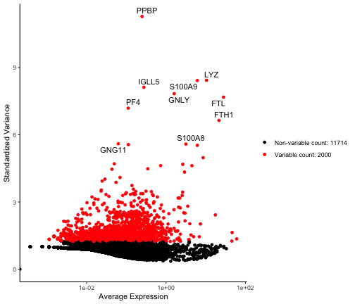<!-- --> ] --- ## There's a lot more We'll stop our sampling here. + Many Bioconductor packages do use ggplot, however some use base graphics - Faster + Key is to find where the data is stored, and use that to create visualizations + Bioconductor tends to create - One monolithic object - Containing different information in slots - combined by lists + `slotNames` and `names` are your friends