class: center, middle, inverse, title-slide # Publication-ready Graphics ### Abhijit Dasgupta ### March 25-27, 2019 --- layout: true <div class="my-header"> <span>PS 312, March 2019</span></div> --- class: inverse, middle > Design is choice. The theory of the visual display of quantitative information consists of principles that generate design options and that guide choices among options. The principles should not be applied rigidly or in a peevish spirit; they are not logically or mathematically certain; and it is better to violate any principle than to place graceless or inelegant marks on paper. Most principles of design should be greeted with some skepticism, for word authority can dominate our vision, and we may come to see only through the lenses of word authority rather than with our own eyes. > > --- Edward Tufte, <cite>The Visual Display of Quantitative Data</cite> --- class: inverse, middle, center # Considerations --- ## Tufte's Principles of Graphical Integrity 1. Show data variation, not design variation 1. Do not use graphics to quote data out of context 1. Use clear, detailed, thorough labelling. 1. Representation of numbers should be directly proportional to numerical quantities 1. Don't use more dimensions than the data require --- ## Tufte's Principles of Graphical Integrity 1. Show data variation, not design variation - Don't get fancy, let the data speak 1. Do not use graphics to quote data out of context - Maintain accuracy 1. Use clear, detailed, thorough labelling. - Use annotations to make your point 1. Representation of numbers should be directly proportional to numerical quantities - This is essential for fair representation 1. Don't use more dimensions than the data require - Be appropriate in use of 3D graphics, for example --- ## Tufte's Fundamental Principles of Design 1. Show comparisons 1. Show causality 1. Use multivariate data 1. Completely integrate modes (like text, images, numbers) 1. Establish credibility 1. Focus on content --- ## 7 Basic Rules for Making Charts and Graphs .right[Nathan Yau, Flowing Data<br> <a href="https://flowingdata.com/2010/07/22/7-basic-rules-for-making-charts-and-graphs/">https://flowingdata.com/2010/07/22/7-basic-rules-for-making-charts-and-graphs/</a> ] 1. Check the data 1. Explain encodings 1. Label axes 1. Include units 1. Keep your geometry in check 1. Include your sources 1. Consider your audience --- class: inverse, center, middle # Where are you publishing? --- ## Medium 1. Memo/Note/Report/Lab Notebook/Presentation (to lab/PI) -- 1. Web page (HTML) -- 1. Poster -- 1. Presentation (PDF/HTML) -- 1. Formal paper: A PDF file / physically printed paper -- #### Audiences are different, so graphical representations may need to be different -- #### Also have different technical requirements --- ## Medium #### Memo/Note/Report/Lab Notebook/Presentation (to lab/PI) - Need to have all the components in place - Start telling the story through the graph - Don't worry too much about formating - Let RMarkdown do its thing --- ## Medium #### Web page (HTML) - Use PNG with at least 72dpi (150 preferred) - Use SVG - Don't make your graphs too wide - Consider interactive graphics --- ## Medium #### Poster Typically we're doing this using PowerPoint, and incorporating output from R There are a few RMarkdown packages out there for poster-making - https://github.com/odeleongt/postr - Using `\(\LaTeX\)` and beamer --- ## Medium #### Poster - Use PDF graphics (easier on a Mac) or high-resolution TIFF - Make fonts, lines, sizes on graphic bigger to make it easier to see --- ## Medium #### Presentations and formal papers .pull-left[ Work on formating - Fonts - Colors - Glyphs - Labeling - Panels/Facets and organization ] .pull-right[ Check any particular requirements from publisher - Resolution - File type - Typically TIFF at 300dpi is required ] --- ## A note on TIFFs - R creates graphs at 72dpi by default - I've had most success creating PDFs or SVGs and converting them - Adobe Acrobat Pro will save PDFs to TIFFs, as will Adobe Illustrator for SVGs - Make sure you use LZW compression, otherwise you'll fail file size requirements #### Using [Ghostscript](https://www.ghostscript.com/) ``` gs -q -dNOPAUSE -dBATCH -sDEVICE=tiff24nc -sCompression=lzw -r300x300 -sOutputFile=<output file> <input file> ``` On Windows, replace `gs` with `gswin32c` #### Using ggplot (appears to give right DPI, but doesn't seem to compress, so files are too big) ``` ggsave('out.tiff', units='in', width=4, height=4, compression = 'lzw', dpi = 300) ``` --- ## A note on TIFFs Using Preview on a Mac <!-- --> --- ## File Formats In general, you will generate a graphics file for your plot by calling a function which will have the same name as the desired file format (svg, pdf, jpeg, etc). ```r library(ggplot2, quietly = TRUE) svg(filename="myPlot.svg", width = 3, height=3, pointsize = 8) ggplot(cars, aes(x=speed)) + geom_density() dev.off() ``` ``` ## quartz_off_screen ## 2 ``` The second command opens a file for output, the third geneates the plot, and the fourth command (dev.off()) finishes writing the file and closes it. By default, graphics go to the last graphics "device" you created and dev.off closes the last graphics device created. --- ## Vector versus Raster (pixel) graphics ```r pdf(file = "test.pdf", width=3, height=3) ggplot(cars, aes(x=speed)) + geom_density() dev.off() ``` ``` ## quartz_off_screen ## 2 ``` ```r png(filename = "test.png", width=3, height=3, units = "in",res = 100) ggplot(cars, aes(x=speed)) + geom_density() dev.off() ``` ``` ## quartz_off_screen ## 2 ``` --- ## File Size test.pdf: 9KB test.png: 16KB Raster graphics take more space but give worse results! In general, you will be better off using vector graphcics when makeing plots and graphs. --- ## Error Bars You create error bars in ggplot by adding an extra plot argument, geom_errorbar. You specify the top and bottom "y" position of the error bar, and optionally the width. You will have to calculate where the error bars should be and choose what they should represent (standard deviation, standard error, 95% confidence interval). --- ## Calculating Standard Error A standard method to achieve error bars would be to calculate standard error and store the value in a column. Be careful! There is a standard error function in R (stderr) that has nothing to do with standard errors! But you can define your on function to calculate it or use a package that supplies the standard error function. ```r sem <- function(x) sqrt(var(x, na.rm=T)/sum(!is.na(x))) cars %>% group_by(speed) %>% summarize(meanDist = mean(dist), semDist = sem(dist)) ``` ``` ## # A tibble: 19 x 3 ## speed meanDist semDist ## <dbl> <dbl> <dbl> ## 1 4 6 4 ## 2 7 13 9 ## 3 8 16 NA ## 4 9 10 NA ## 5 10 26 4.62 ## 6 11 22.5 5.5 ## 7 12 21.5 2.99 ## 8 13 35 4.12 ## 9 14 50.5 12.1 ## 10 15 33.3 10.5 ## 11 16 36 4 ## 12 17 40.7 5.21 ## 13 18 64.5 9.54 ## 14 19 50 9.45 ## 15 20 50.4 5.31 ## 16 22 66 NA ## 17 23 54 NA ## 18 24 93.8 10.2 ## 19 25 85 NA ``` --- ## Error Bar Example ```r sem <- function(x) sqrt(var(x, na.rm=T)/sum(!is.na(x))) cars %>% group_by(speed) %>% summarize(meanDist = mean(dist), semDist = sem(dist)) %>% ggplot(aes(x=speed, y=meanDist)) + geom_bar(stat="identity") + geom_errorbar(aes(ymin=meanDist - semDist, ymax= meanDist+semDist)) ``` <!-- --> --- ## Adjusting factor ordering If you are plotting a factor, you can determine the order that ggplot arranges things by changing the order of the factor ```r ggplot(chickwts, aes(x=feed, y=weight)) + geom_boxplot() ``` <!-- --> --- ## Changing the factor order ```r chickwts <- chickwts %>% mutate(feed = fct_reorder(feed, weight, mean)) ggplot(chickwts, aes(x=feed, y=weight)) + geom_boxplot() ``` <!-- --> --- ## Changing the axis title ```r ggplot(chickwts, aes(x=feed, y=weight)) + geom_boxplot() + labs(x = 'Feed Type', y = 'Chick Weight') ``` <!-- --> --- ## Changing the axis limits ```r ggplot(chickwts, aes(x=feed, y=weight)) + geom_boxplot() + scale_y_continuous("Chick Weight", limits=c(0,500)) + scale_x_discrete("Feed Type") ``` <!-- --> --- ## Log scale ```r ggplot(chickwts, aes(x=feed, y=weight)) + geom_boxplot() + scale_y_log10("Chick Weight", limits=c(10,500)) + scale_x_discrete("Feed Type") ``` <!-- --> --- ## Coloring of Factors ```r ggplot(chickwts, aes(x=weight, fill=feed)) + geom_density(alpha=0.5) + scale_x_continuous("Chick Weight", limits=c(0,500))+ labs(fill = 'Feed') ``` <!-- --> --- ## Manual Color Scale ```r ggplot(chickwts, aes(x=weight, fill=feed)) + geom_density(alpha=0.5) + scale_x_continuous("Chick Weight", limits=c(0,500)) + scale_fill_manual("Feed Type",values = c("red","orange","yellow","green","blue","violet")) ``` <!-- --> --- ## Fill Color Brewer ```r ggplot(chickwts, aes(x=weight, fill=feed)) + geom_density(alpha=0.5) + scale_x_continuous("Chick Weight", limits=c(0,500)) + scale_fill_brewer("Feed Type") ``` <!-- --> --- ## Fill Color Brewer ```r ggplot(chickwts, aes(x=weight, fill=feed)) + geom_density(alpha=0.5) + scale_x_continuous("Chick Weight", limits=c(0,500)) + scale_fill_grey("Feed Type") ``` <!-- --> --- ## Changing Plot "Theme" ```r ggplot(chickwts, aes(x=weight, fill=feed)) + geom_density(alpha=0.5) + scale_x_continuous("Chick Weight", limits=c(0,500)) + scale_fill_discrete("Feed Type") + theme_bw() ``` <!-- --> --- ## Minimal Theme ```r ggplot(chickwts, aes(x=weight, fill=feed)) + geom_density(alpha=0.5) + scale_x_continuous("Chick Weight", limits=c(0,500)) + scale_fill_discrete("Feed Type") + theme_minimal() ``` <!-- --> --- ## Personal theme .pull-left[ ```r mytheme <- theme(axis.ticks = element_blank(), axis.text = element_text(color = 'blue', family='Times New Roman'), axis.title = element_text(color = 'red', family = 'Times New Roman', size = 20)) ggplot(chickwts, aes(x = weight, fill = feed))+geom_density(alpha = 0.5) + labs(x = 'Chick Weight', y = '', fill = 'Feed Type') + mytheme ``` ] .pull-right[ 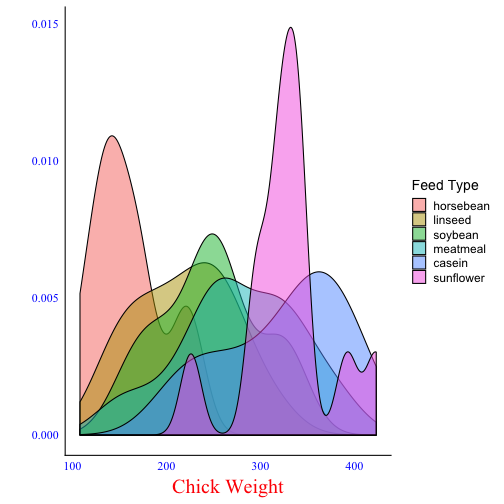<!-- --> ] --- ## Graph Refinement Chances are that you will continue to refine your graph during the manuscript process. Make the code for each graph a separate "R script", so that it is easy to: - Make changes - Regenerate the graph - See what data and commands were used to generate each graph - Cut and paste for similar work later --- ## Example Script <img src="script.png" width="700px" /> --- ## Multiple Graphs The packages `cowplot` and [`ggpubr`](https://rpkgs.datanovia.com/ggpubr/index.html) make putting different graphs on the same panel pretty straightforward. ```r # install.packages('cowplot') library(cowplot) p1 <- ggplot(iris, aes(Sepal.Length, Sepal.Width, color = Species)) + geom_point() + facet_grid(. ~ Species) + stat_smooth(method = "lm") + background_grid(major = 'y', minor = "none") + panel_border() + theme(legend.position = "none") # plot B p2 <- ggplot(iris, aes(Sepal.Length, fill = Species)) + geom_density(alpha = .7) + theme(legend.justification = "top") p2a <- p2 + theme(legend.position = "none") # plot C p3 <- ggplot(iris, aes(Sepal.Width, fill = Species)) + geom_density(alpha = .7) + theme(legend.position = "none") # legend legend <- get_legend(p2) # align all plots vertically plots <- align_plots(p1, p2a, p3, align = 'v', axis = 'l') # put together bottom row and then everything bottom_row <- plot_grid(plots[[2]], plots[[3]], legend, labels = c("B", "C"), rel_widths = c(1, 1, .3), nrow = 1) plot_grid(plots[[1]], bottom_row, labels = c("A"), ncol = 1) ``` --- ## Multiple Graphs <img src="lecture_pubgraphics_files/figure-html/unnamed-chunk-21-1.png" style="display: block; margin: auto;" /> --- ## Multiple plots .pull-left[ ```r library(ggpubr) data("ToothGrowth") df <- ToothGrowth df$dose <- as.factor(df$dose) # Create some plots # :::::::::::::::::::::::::::::::::::::::::::::::::: # Box plot bxp <- ggboxplot(df, x = "dose", y = "len", color = "dose", palette = "jco") # Dot plot dp <- ggdotplot(df, x = "dose", y = "len", color = "dose", palette = "jco") ggarrange(bxp, dp, common.legend = TRUE) ``` ] .pull-right[ 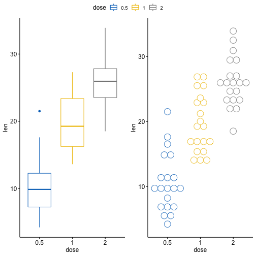<!-- --> ] --- ## Fine-tuning the theme ```r plt <- ggplot(bl, aes(x = estimate)) + geom_histogram(bins = 50)+#geom_density() + facet_grid(Event ~ Race, scales = 'free', switch = 'y', space = 'free_x') + geom_vline(xintercept = 1, linetype = 2) + geom_segment(data = bl2, aes(x = estimate, xend=estimate, yend = 5, y = hts), color='red', size = 1.5, arrow = arrow(length = unit(.2, 'cm')))+ scale_x_continuous(breaks = c(1, seq(0.7, 1.8, by = 0.2)))+ # Unified the x-axis ticks labs(x = 'Adjusted HR, compared to Whites', y = '') + * theme(strip.text = element_text(size = 14, face = 'bold'), * strip.text.y = element_text(angle = 180), # Rotate the y-axis labels * strip.background.x = element_rect(fill = 'white'), * strip.placement = 'outside', # Move labels outside the borders * axis.text.y = element_blank(), * axis.ticks.y = element_blank(), * axis.text.x = element_text(size = 8), * panel.spacing.x = unit(2, 'lines')) ``` --- <!-- --> --- ## Directly creating PowerPoints You can now use RMarkdown to create PowerPoint presentations [reference](https://bookdown.org/yihui/rmarkdown/powerpoint-presentation.html){target="_blank"} ``` --- title: "Your Presentation" author" "James T. Kirk" output: powerpoint_presentation --- ``` This might be useful if you want to copy slides into different presentations directly. --- class: inverse, center, middle ## Final Presentations --- ## Final Presentations I would like to suggest that everyone send their final presentation to me as a "pdf" file, with the file name being "LastFirst.pdf" (for example "BuehlerEugen.pdf"). This will make it easy to order the files into a single presentation. Two hours is not a lot of time for so many people to present, so there may be only ~10 minutes per person for presentations. It is OK to add slides that you want us to see but that you have to skip over for time. --- ## Final Presentation Contents Should include the following five elements, demonstrating the code and the results of the code to <OL> <LI>Use a package not loaded by default in the base distribution <LI>Read in a data set from a file <LI>Manipulate the data in some way <LI>Do a statistical test of the data <LI>Make a graph from the data </OL> The material doesn't have to be presented in that order, and could include more (data background, more than one graph or statistical test, etc). Your grade will be determined based on how many of the five requirements your demonstrate (in your slides). --- ## Grading Scheme <UL> <LI>A = All five elements demonstrated <LI>B = Four elements demonstrated <LI>C = Three elements demonstrated <LI>D = Two elements demonstrated <LI>F = One or zero elements demonstrated </UL>