We’re making the decision to use ggplot2 for graphics
Makes pretty good formatting choices out of the box
Works like pipes!!
Is declarative (tell it what you want) without getting caught up in minutae
Strongly leverages data frames (good practice)
Fast enough
There are good templates if you want to change the look
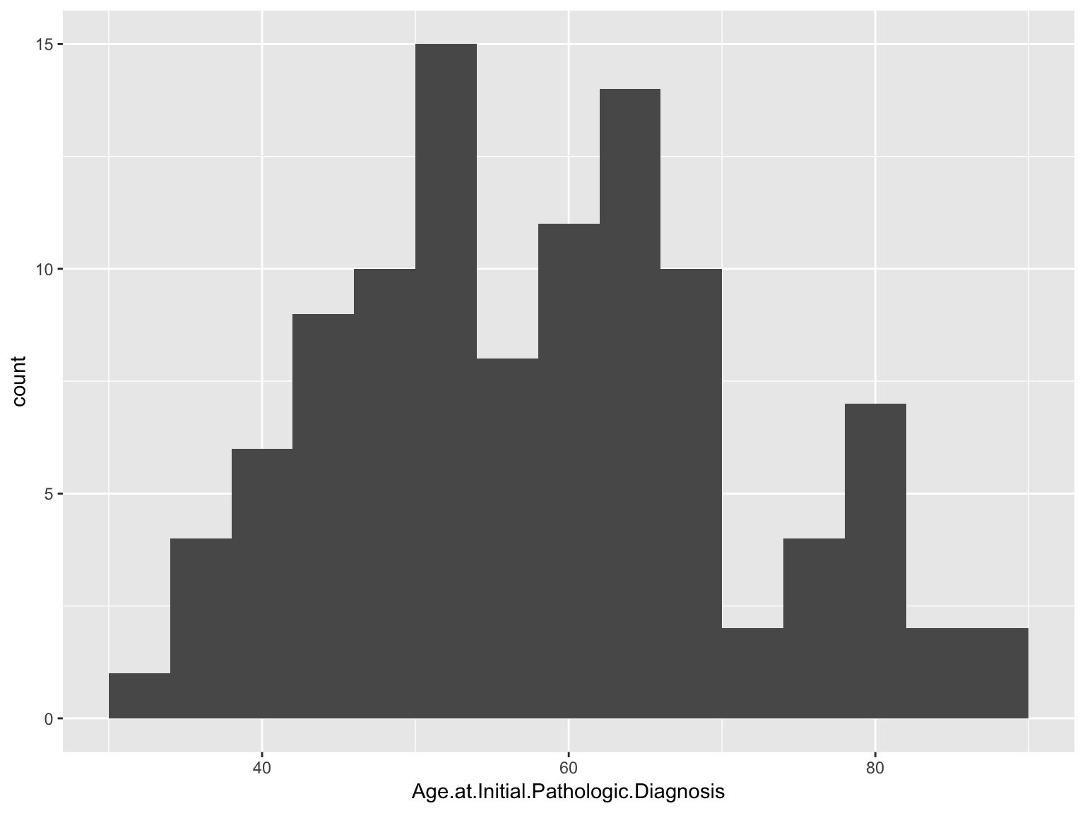
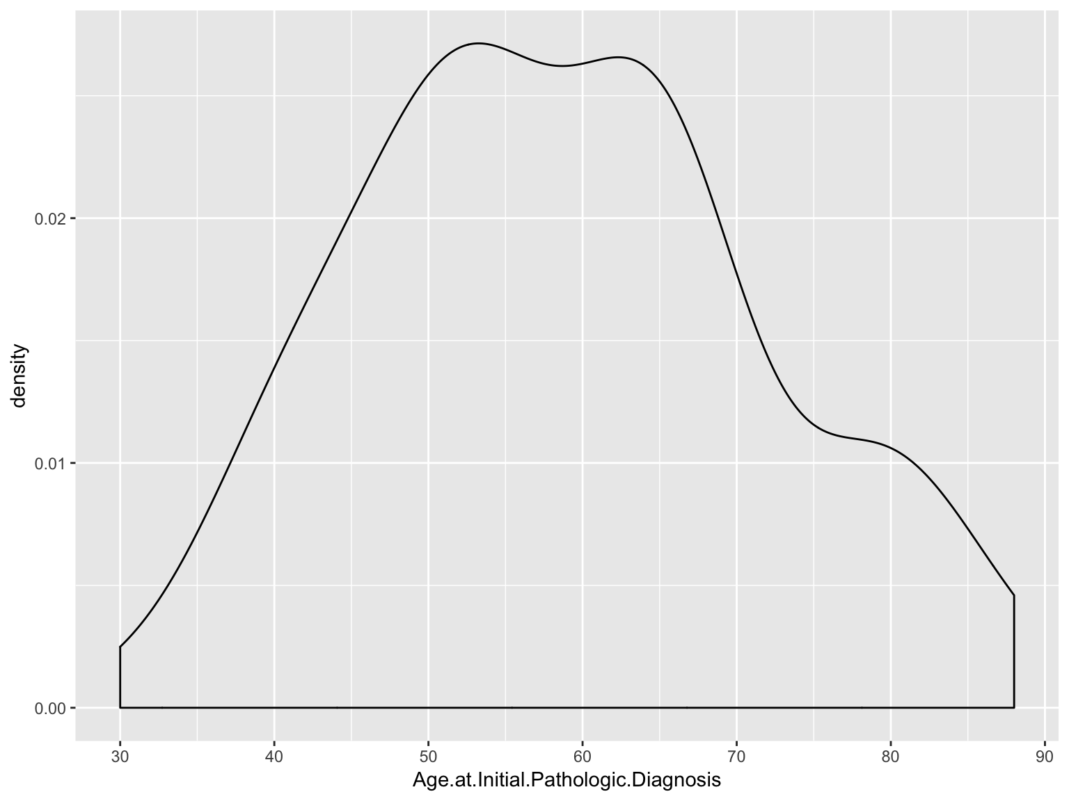
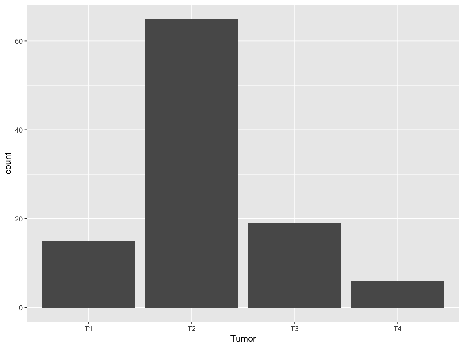
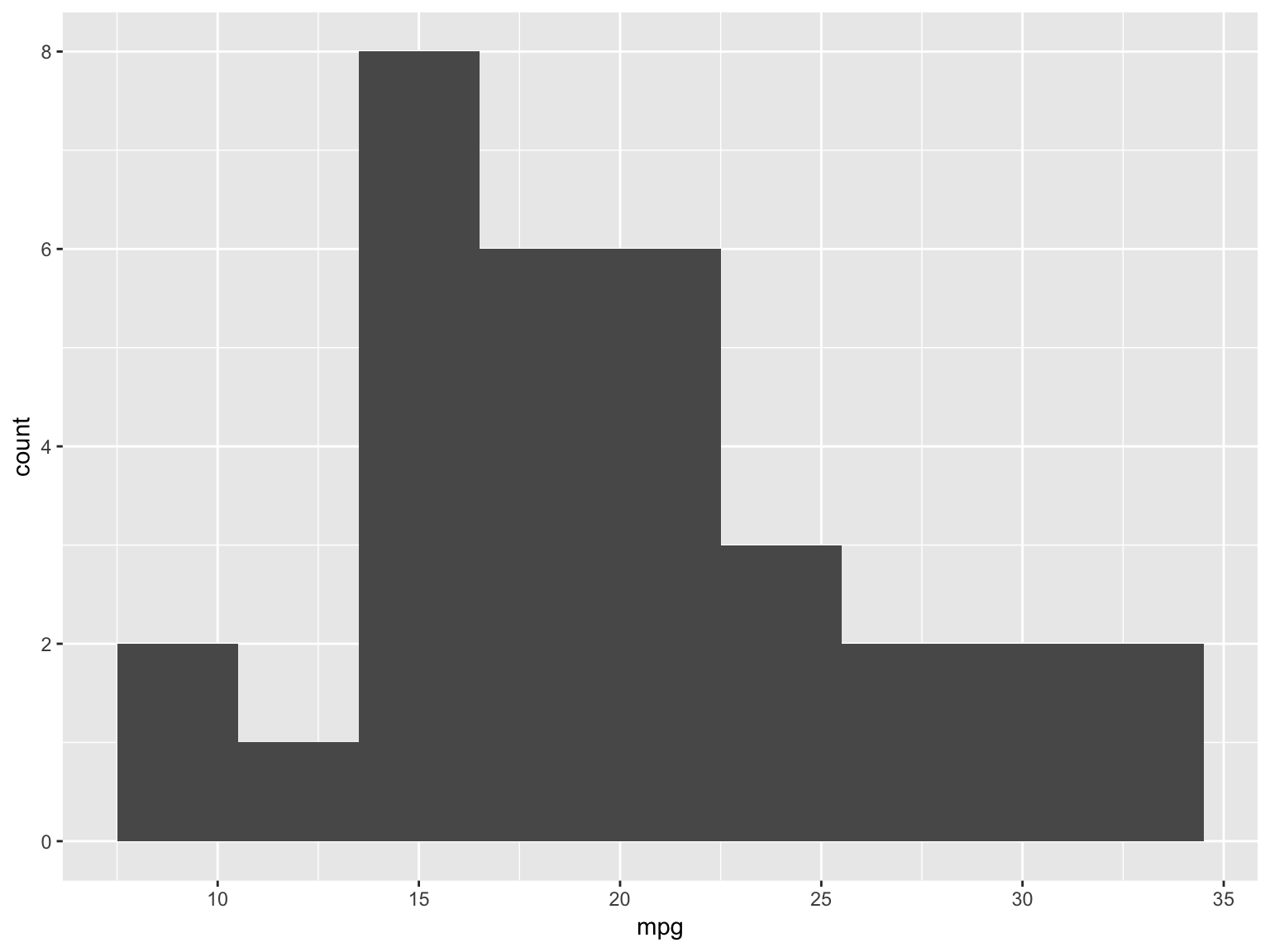
Introduction to ggplot2
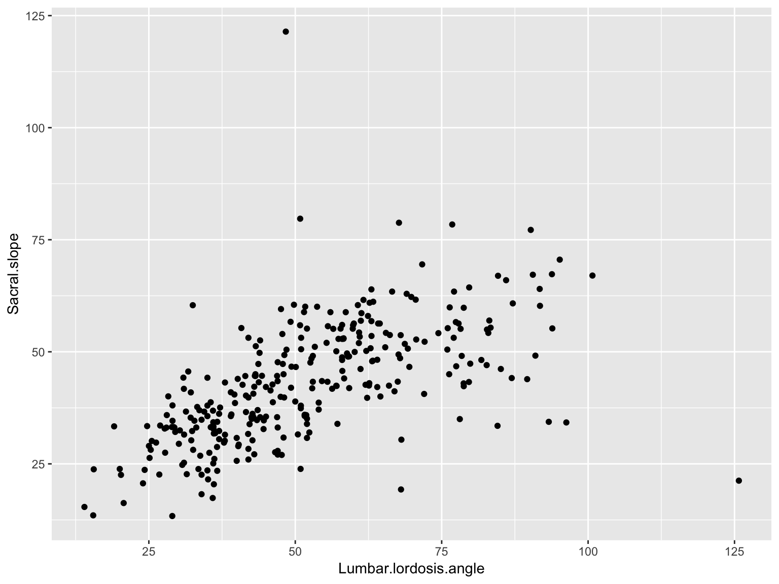
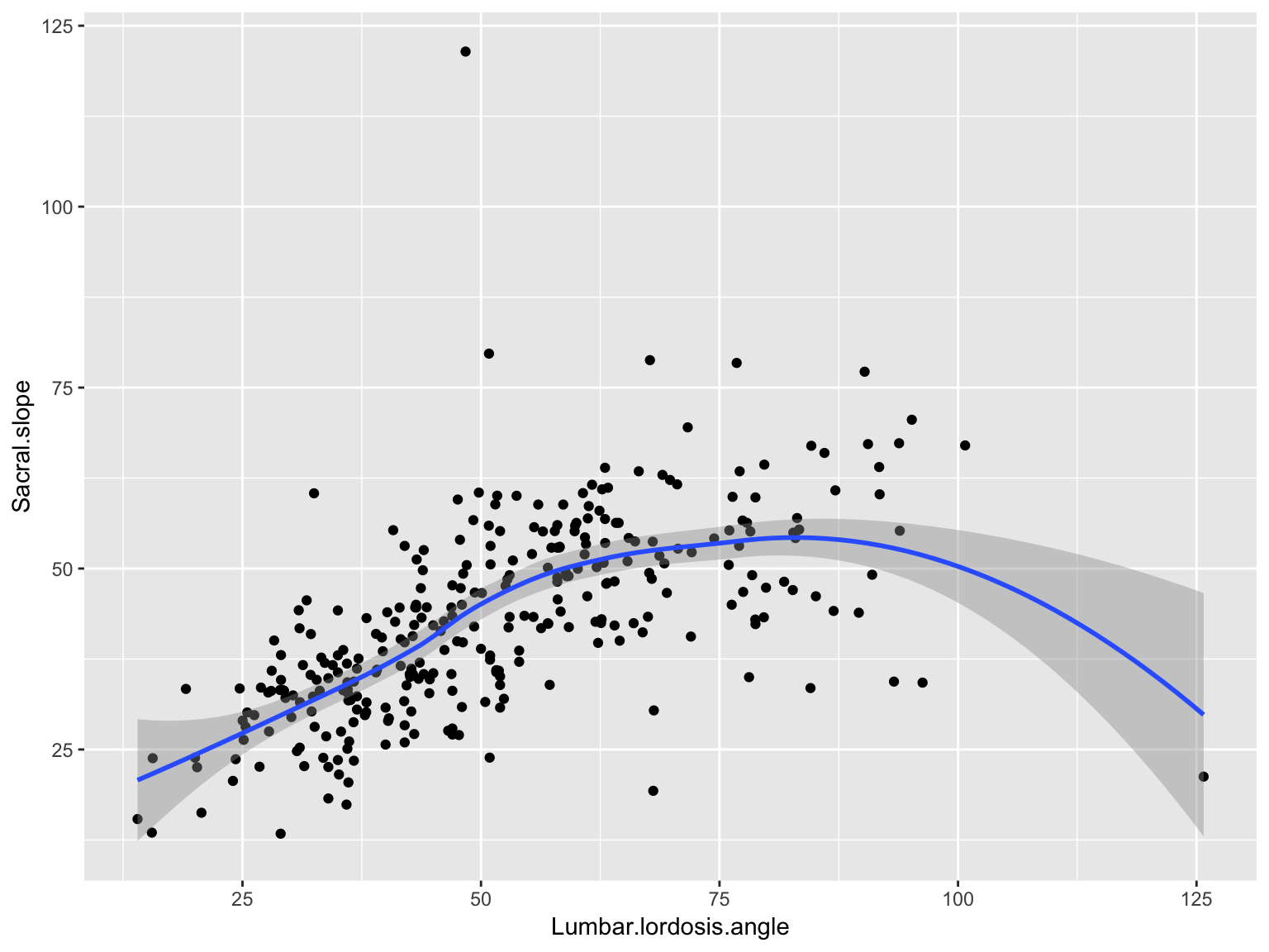
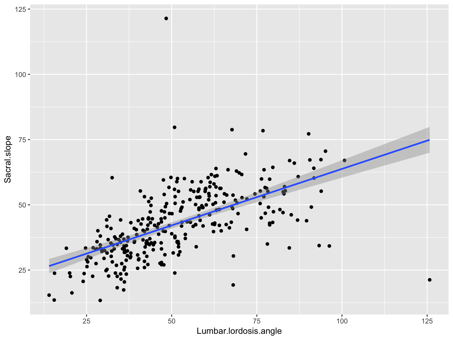
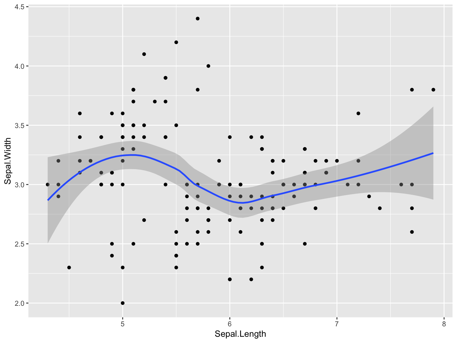
The ggplot2 package is a very flexible and (to me) intuitive way of visualizing data. It is based on the concept of layering elements on a canvas.
This idea of layering graphics on a canvas is, to me, a nice way of building graphs
Introduction to ggplot2
You need:
A data.frame object
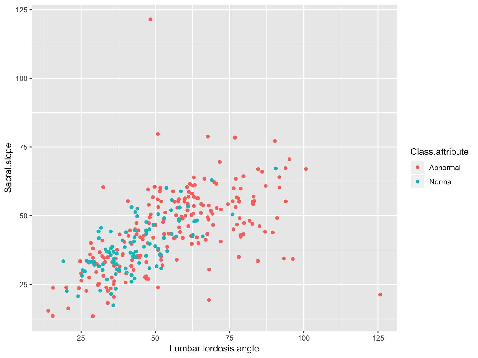
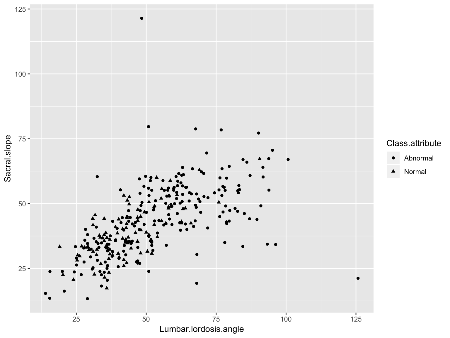
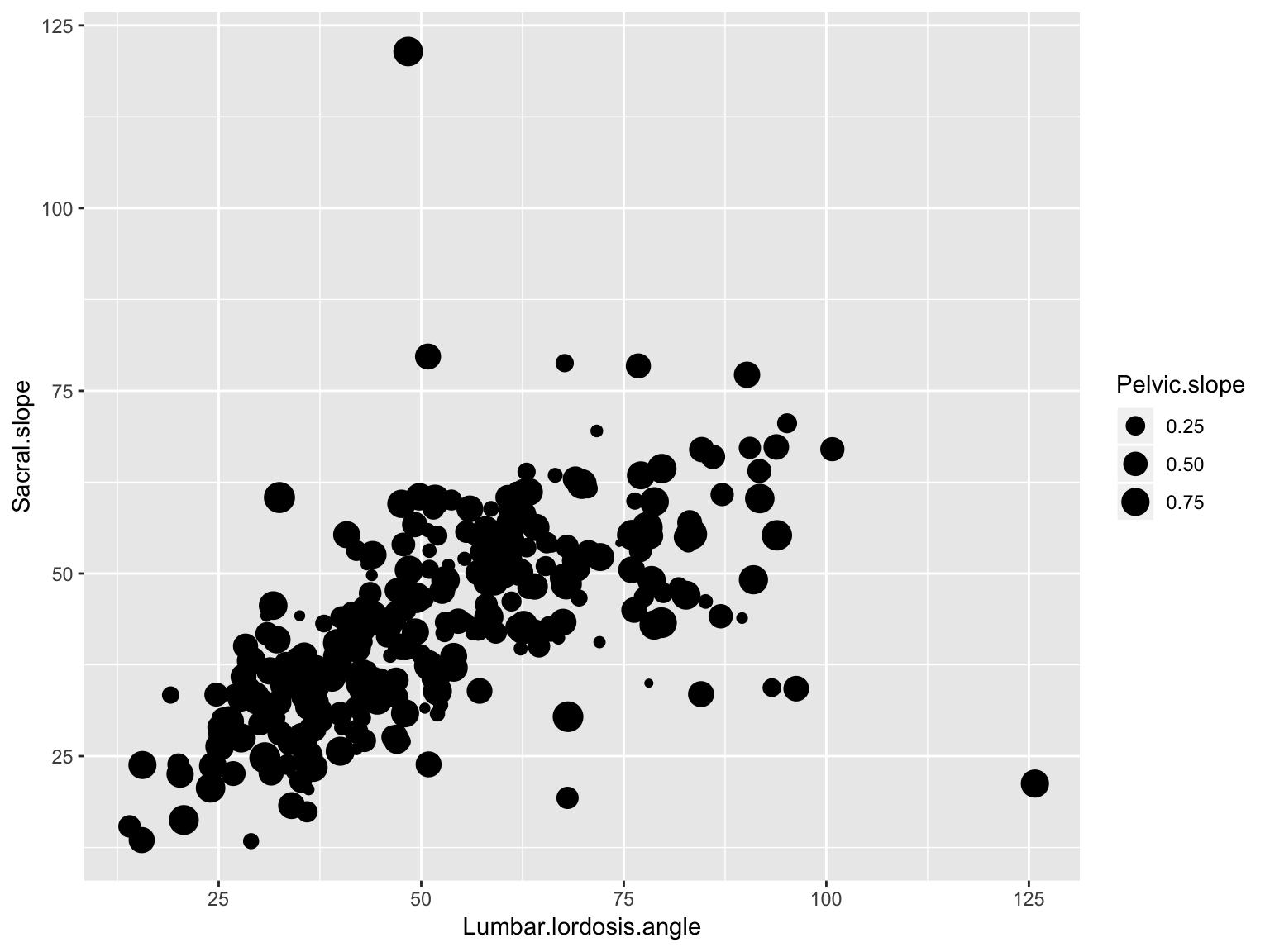
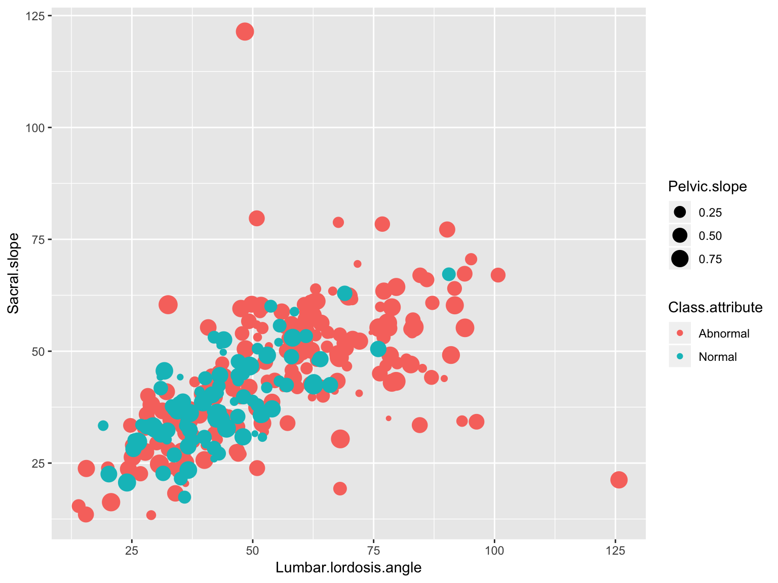
Aesthetic mappings (aes) to say what data is used for what purpose in the viz
x- and y-direction
shapes, colors, lines
A geometry object (geom) to say what to draw
You can “layer” geoms on each other to build plots
Introduction to ggplot2
ggplot used pipes before pipes were a thing.
However, it uses the + symbol for piping rather than the %>% operator, since it pre-dates the tidyverse
Emphasize that ggplot uses the + sign for piping, while the rest of the tidyverse uses the %>% symbol
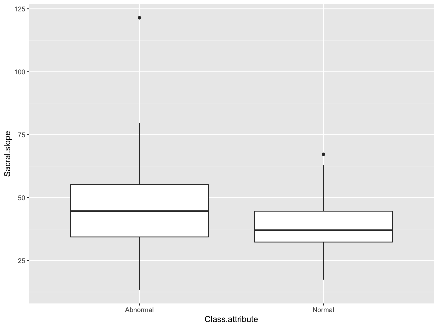
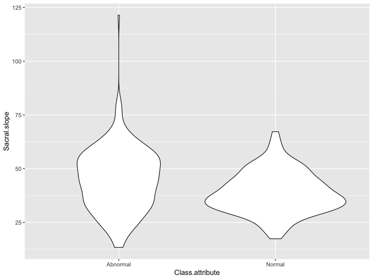
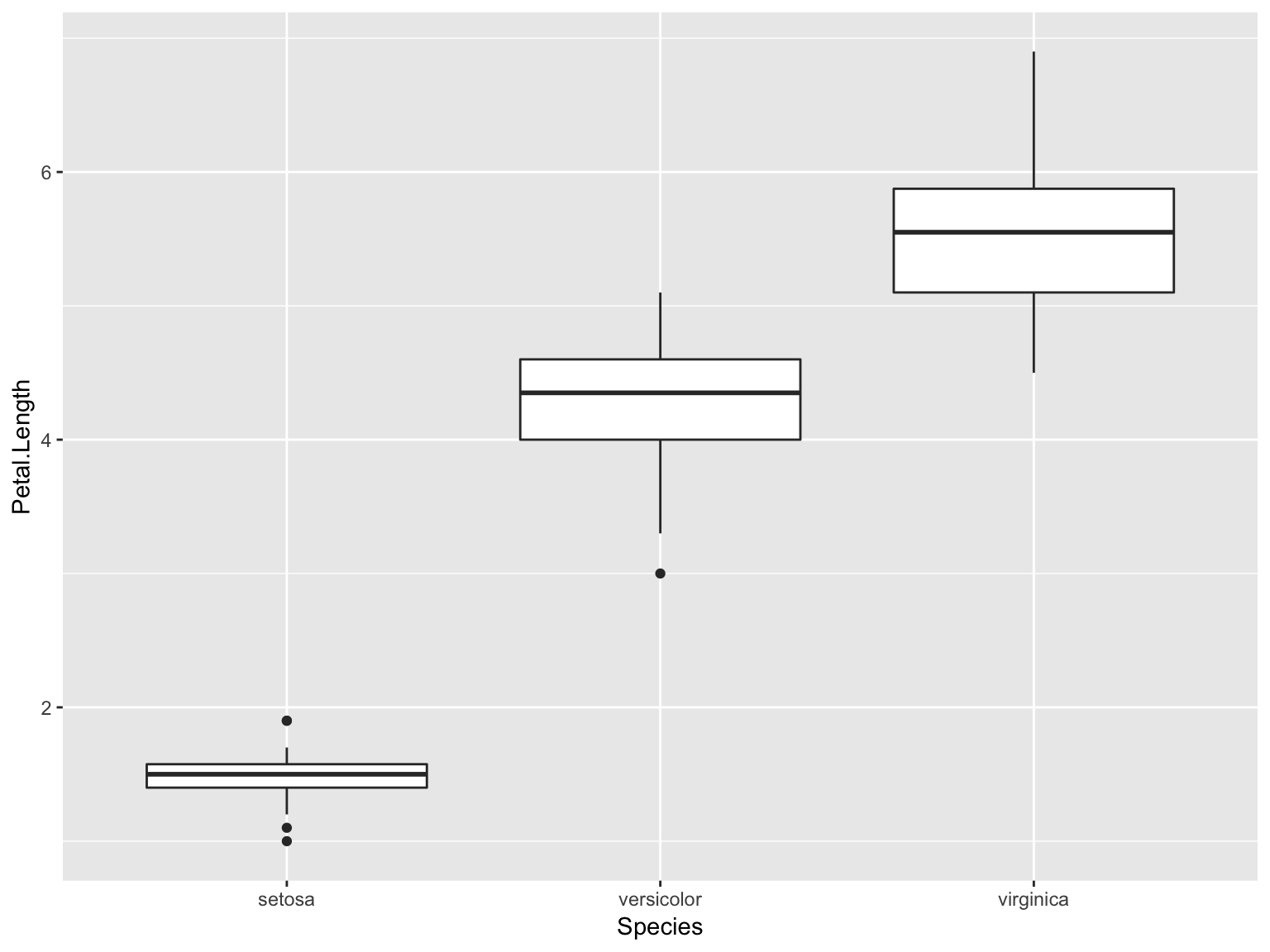
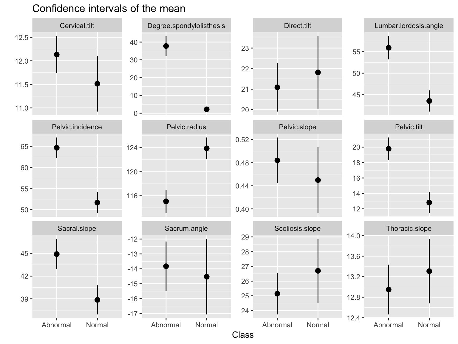
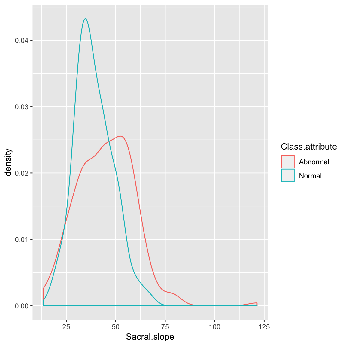
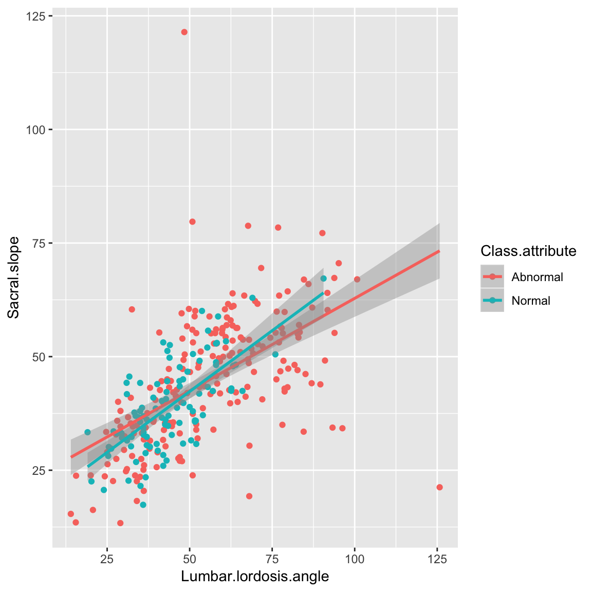
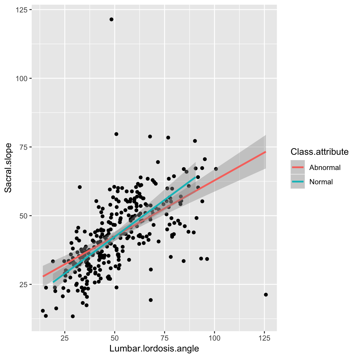
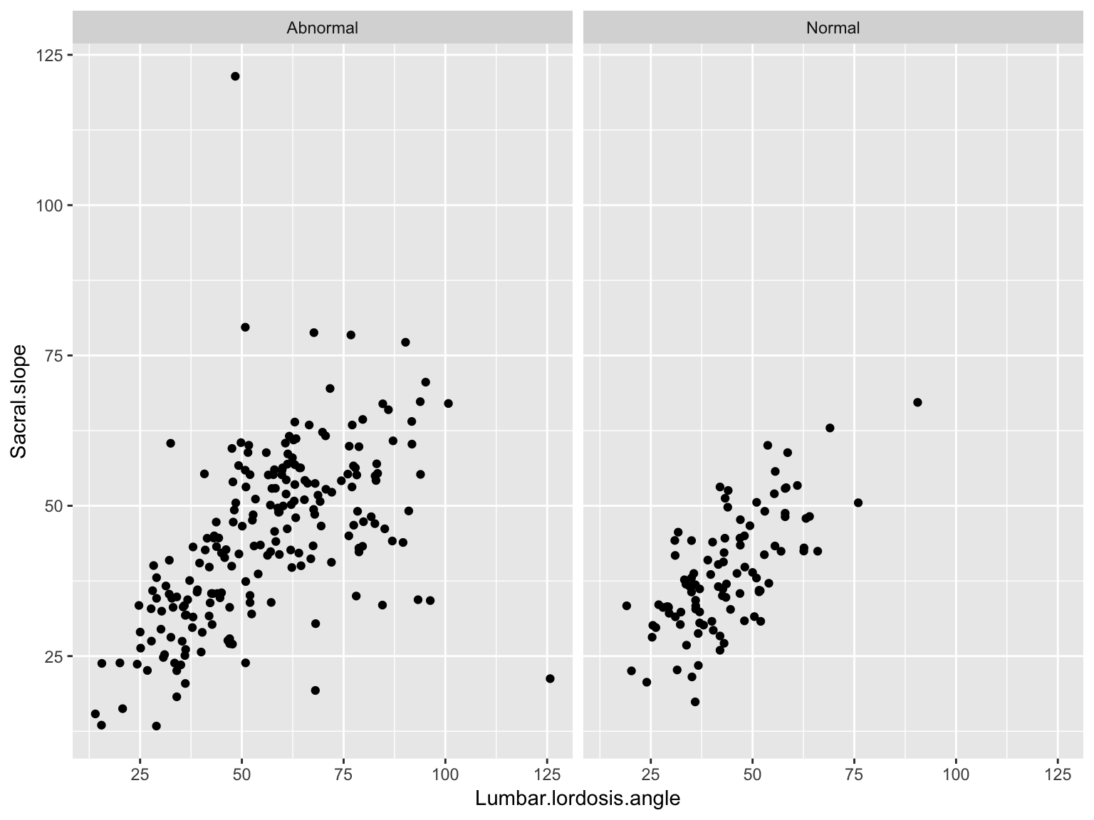
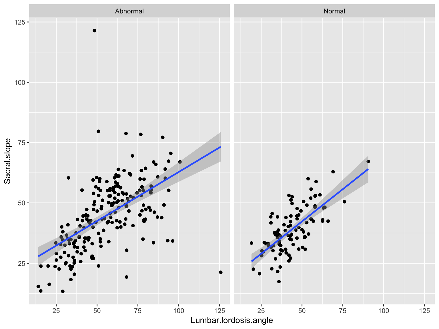
Group-wise descriptives and visualizations
Grouping
It is common to look at statistics within subgroups of the data
The idea is to see if secondary variables affect your primary outcome or relationship
Introducing the dplyr package
dplyr is the most lucid package for manipulating and analyzing data organized in a data frame.
It has a group_by function which creates a grouped data frame
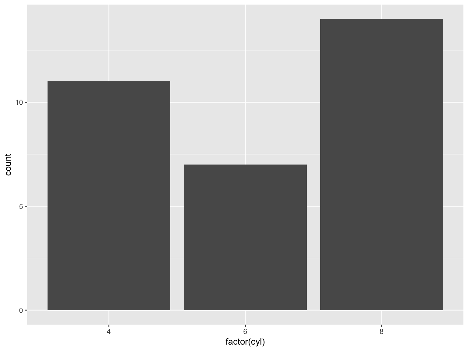
library (dplyr)grouped_data_spine = data_spine %>% group_by (Class.attribute) Note that you have to group using a discrete valued variable (factor, character, integer)
Note that dplyr is included in the tidyverse meta-package, just like ggplot2, so just doing library(tidyverse) will suffice.
Grouped summaries
grouped_data_spine %>% summarize_all (mean) # # A tibble: 2 x 13
# Class.attribute Pelvic.incidence Pelvic.tilt Lumbar.lordosis…
# <fct> <dbl> <dbl> <dbl>
# 1 Abnormal 64.7 19.8 55.9
# 2 Normal 51.7 12.8 43.5
# # ... with 9 more variables: Sacral.slope <dbl>, Pelvic.radius <dbl>,
# # Degree.spondylolisthesis <dbl>, Pelvic.slope <dbl>, Direct.tilt <dbl>,
# # Thoracic.slope <dbl>, Cervical.tilt <dbl>, Sacrum.angle <dbl>,
# # Scoliosis.slope <dbl>
A note on tibbles
Tibbles are a new-generation object meant to enhance the data.frame.
If you want to just get back to a more familiar data.frame object, use as.data.frame
A tibble is built on a data.frame, so all operations on data.frame’s will work.
To see all columns, set options(dplyr.width=Inf).
A note on tibbles
Differences between a tibble and a data.frame:
Printing a tibble is restricted to the first 10 lines, and includes column types
Stricter subsetting rules that make the types of objects created consistent
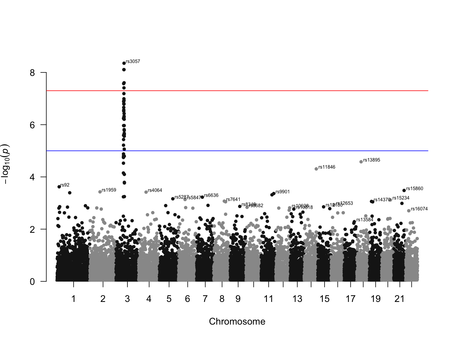
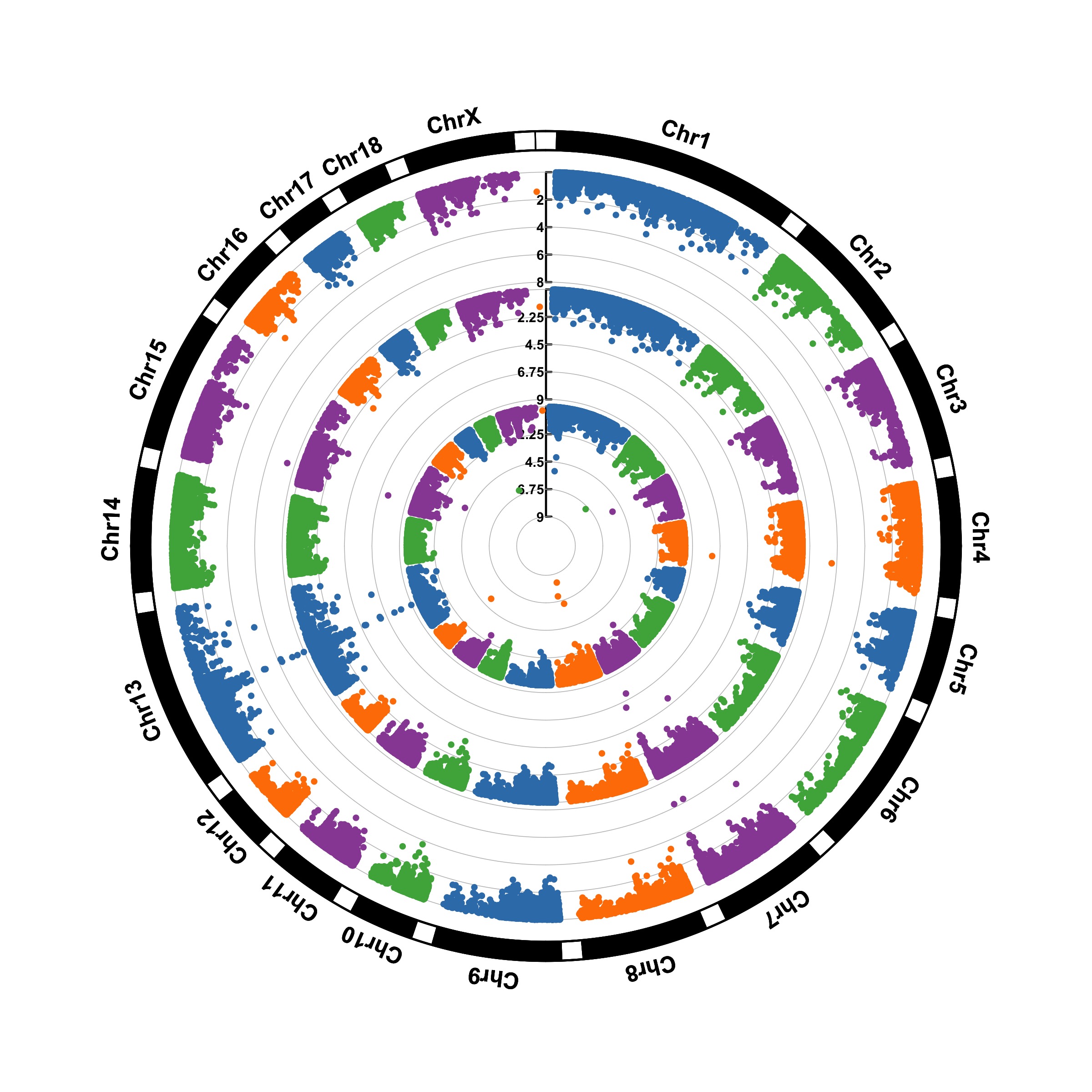
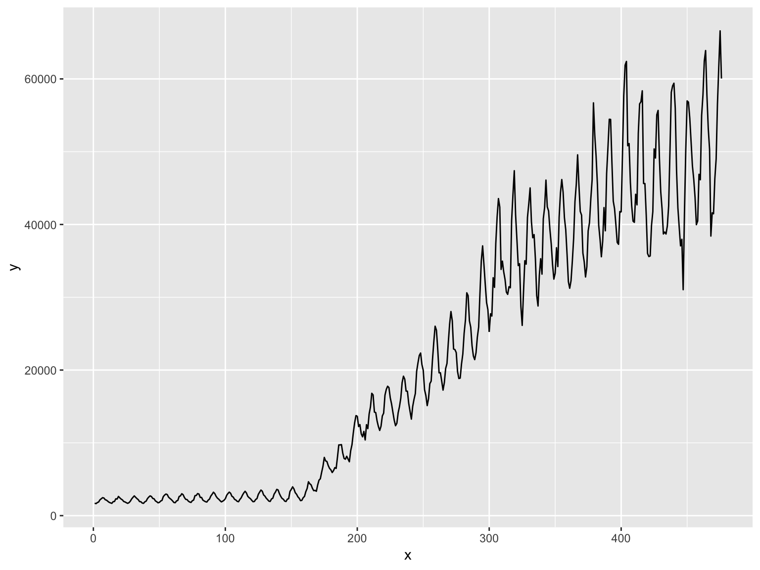
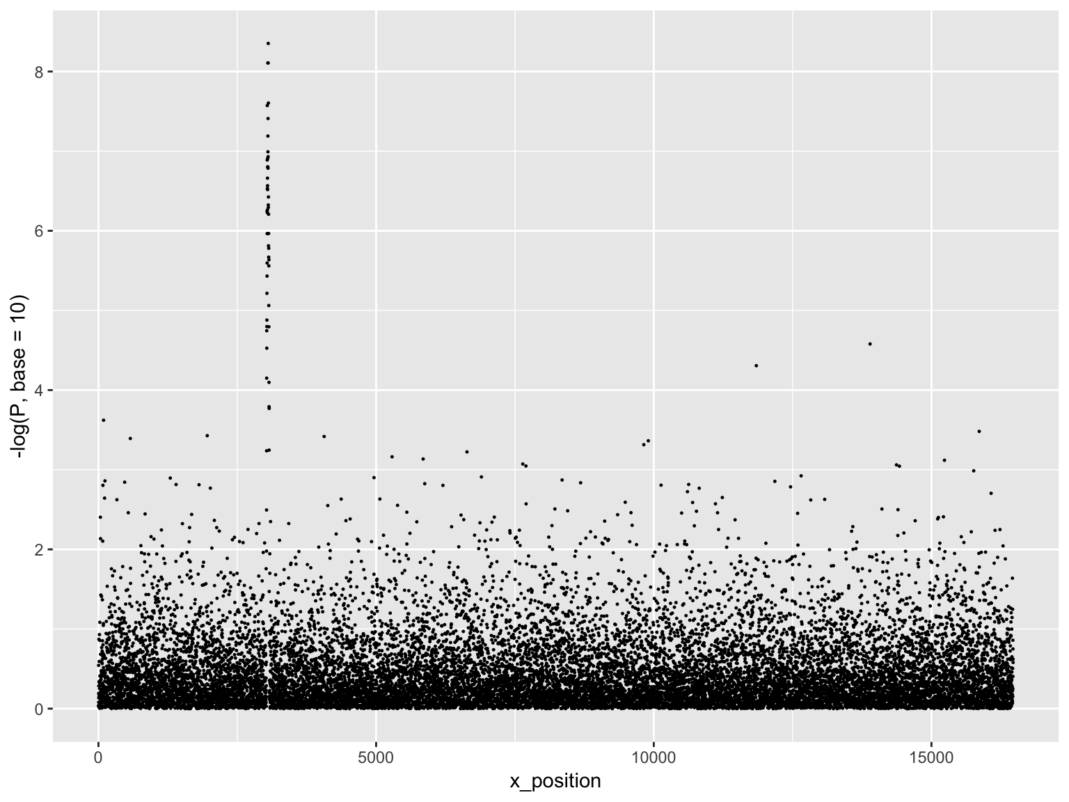
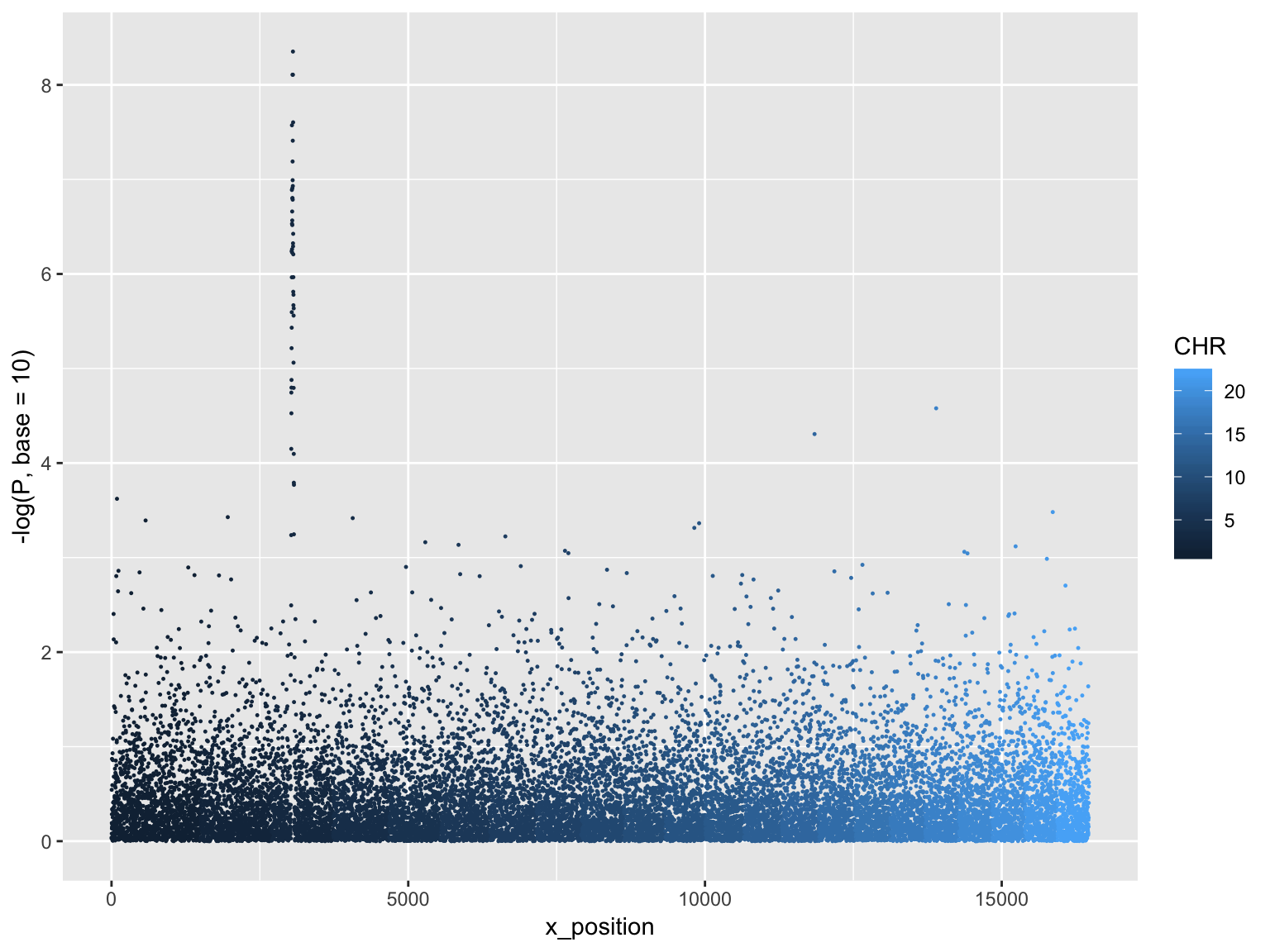
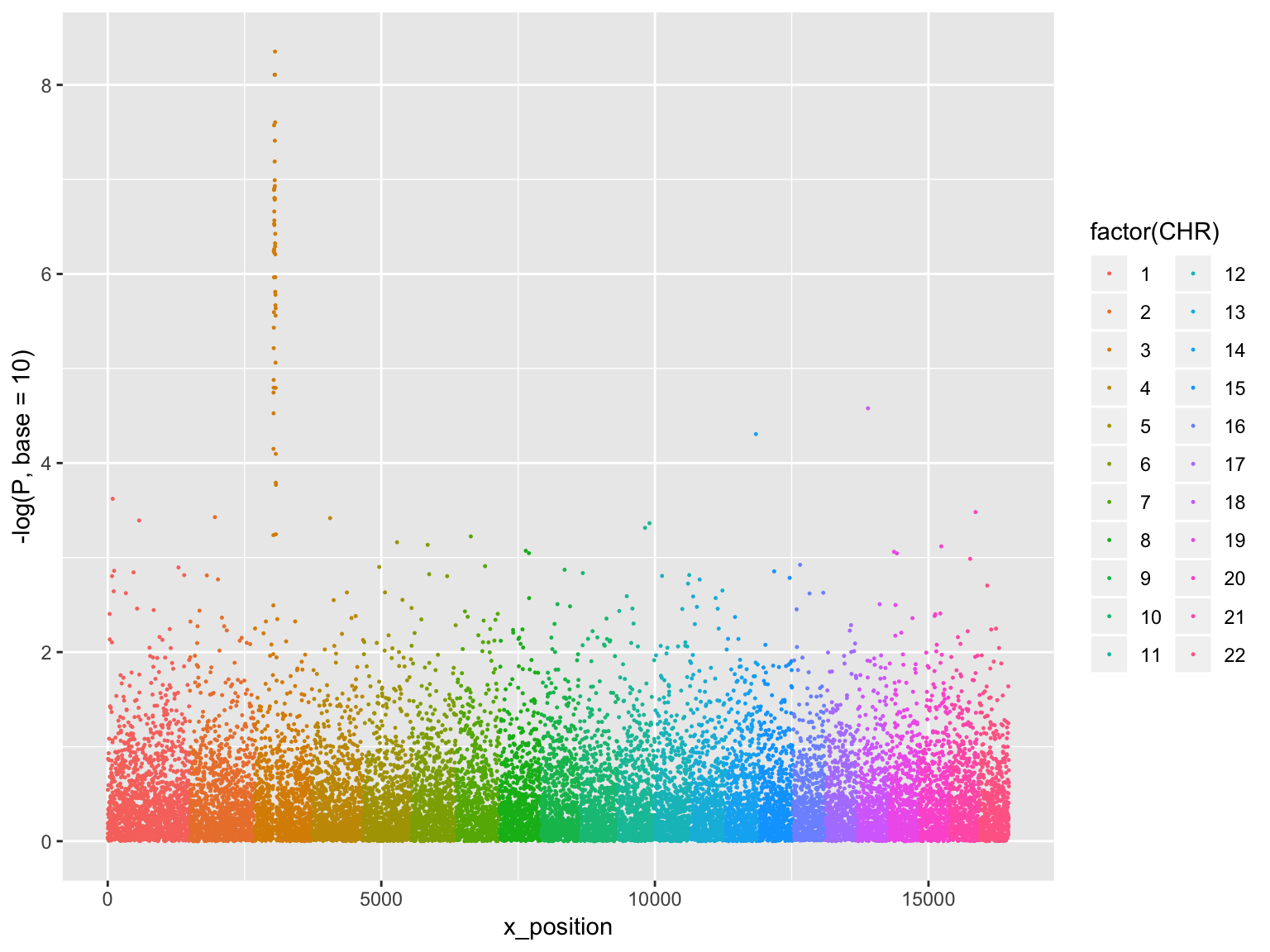
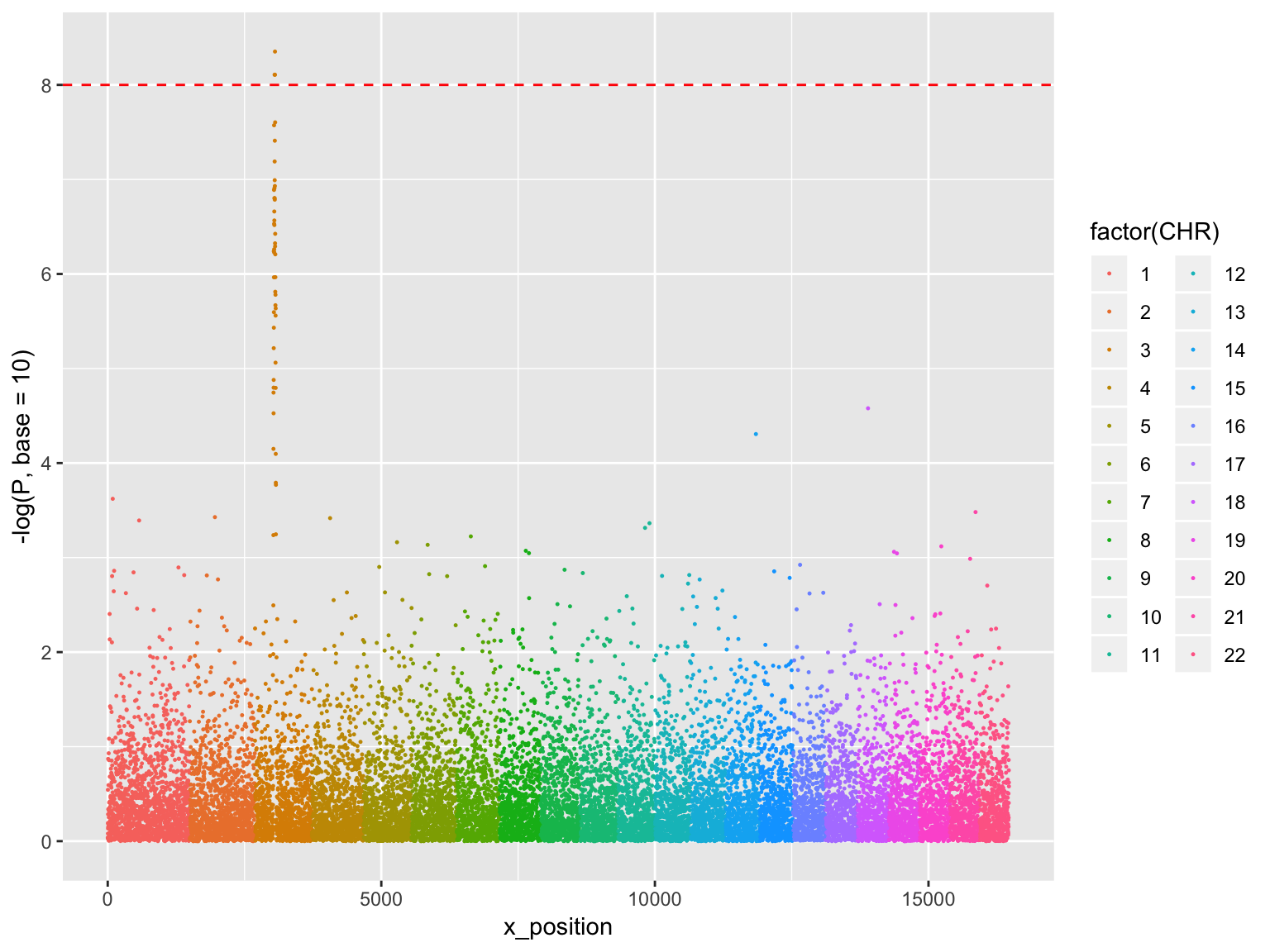
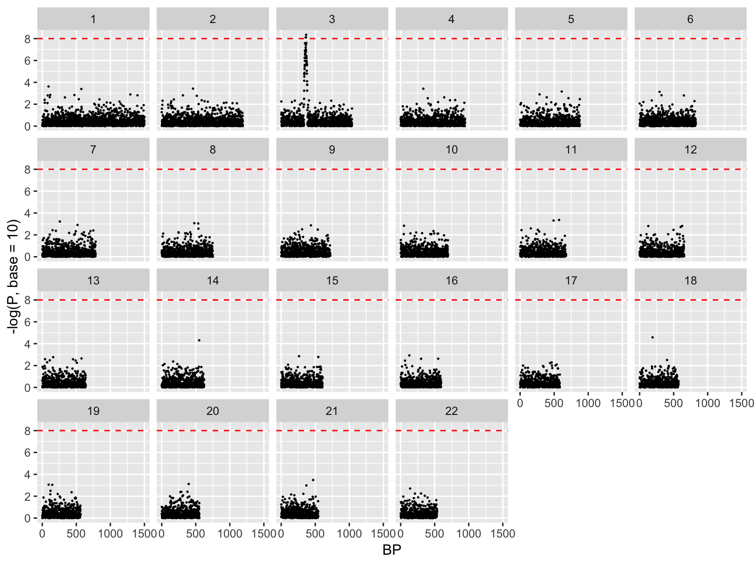
Manhattan plot, exploded